Kotaku is a news blog about videogames and Otaku culture. It is built to be as light as possible, while still looking good. The colour scheme is unlikely, but works nicely, and only the header and side bar are coloured, the main page just being headlines, abstracts and accompanying pictures. Clicking on the stories gives you the full account of the news, and then the comments section follows that. The site is so pared down, and yet you don't miss anything, you have everything you need. Regular commenters have their own pages where they can organise and keep track of all their comments and replies across all the stories. The site is functional, and never confusing. The only problem is that searching up old stories isn't comprehensive, but as it is a site specialising in the very latest news, most people only find the last two pages relevant anyway, and the site is designed to be checked up on over and over for the very latest news.
I like Kotaku for it's stripped down design and emphasis on practicality.
Showing posts with label websites. Show all posts
Showing posts with label websites. Show all posts
Wednesday, 7 October 2009
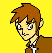
heartshapedskull.com
Heart shaped skull is the website that hosts the comic 'Serenity Rose', among other things.
It could be more user-friendly by having the comments under each comic automatically, and the blog on a front page instead, but other than that the site is fairly clear and easy to use.
What makes the site worth writing about is the sublime presentation. The feel of the site really gives you an idea of the mood of the comic, and the polished look makes it very unique, and it is still very functional, with no rough edges.
The flash animation of the main character is seamlessly incorporated at the top of the page, and looks none the worse for having been processed through flash, as many such things do.
The way it is integrated through the navigation bar is inspired and ties the page together very well.
I think it is a very impressive website, and an even more impressive comic, rendered beautifully in pencil and coloured cleverly and stylishly in photoshop. Definitely worth a look.
topshop.com
Topshop.com is a very clear, easily navigable website. The black and white patterned layout is stylish, without compromising on the clarity or simplicity of the website.
The website has a straightforward, clean navigation bar, with a separate link for each type of product available. Together with the search bar in the top right hand corner, it is extremely easy to browse all products and find any particular item you may be searching for. The well-shot photographs illustrate each individual product in it's best light, and each individual product page includes a brief description along with how-to-wear fashion advice. As well as product images, there are more promotional photographs, showing appropriate models wearing the most popular pieces in Topshop’s clothing range. The models are extremely well chosen, beautiful, but naturally so. Simplicity is certainly the strong point of topshop.com. It is clear that a great deal of time and effort has gone into the website, as there is a lot of detail on each page, but it is done in a way which isn’t overbearing, and the rule of simplicity and style has been taken so much to heart in the building of this site that it has essentially become the theme.
Simplicity and Style permeate everything on every page.
BBC website
The BBC website needs no introduction, but I mention it here because I agree with Charlie Brooker that it is a 'national treasure'.
It is perfectly balanced, with an intuitive layout of information. The hierarchy doesn't at first glance seem as if it would be optimal, but when you use it, it just works. Everything is where you first expect to find it, and nothing you're searching for is hard to get at.
The design is classy and appropriately clear, with nothing unnecessary cluttering up the pages.
Other tangential applications are just as usable and smooth, and everything comes together as a unified whole.
We all use it and see it so often we don't really think about it, but it's many features are a swiss army knife with tools that will appeal to everybody, presented so well as for the whole site to be perfectly pitched for internet addicts, or new users.
Subscribe to:
Comments (Atom)