Thursday, 8 October 2009

The Life Aquatic


The life aquatic is possibly my favourite Bill Murray movie, with a brilliant performance from him, and another scene stealer from Jeff Goldblum. Bill Murray's trademark deadpan attitude works so well in this film, and contrasts nicely with the quirkiness of the visuals, which I find myself unable to describe, it needs to be seen to understand properly, but quirky is the best word. The film is beautiful, and the team zissou typeface as can be seen on the movie poster above, is very well chosen, it has a very specific feel that really fits in with the mood. The editing is also very well done, with some hilarious shots, my favourite being during the raid on the hotel where Seu Jorge, the black crew member wears his diving headpiece like a ridiculous hat, that had me laughing uncontrollably.
The film skews between humour and tragedy, similarly to Withnail & I, and has an extremely touching ending. The last shot is actually a parody of reality, where Sofia Coppola's father carried her on his shoulders down a red carpet. As Steve Zissou boards his boat once again, having won respect once more, he is haunted by his losses; his dead adopted son stands atop the boat smoking a pipe, looking out to see, appearing for a curtain call.

Lost in Translation

Lost in Translation is a film by Sofia Coppola, and stars Bill Murray and Scarlett Johansson. The film is set in Tokyo and focuses on two people who begin to question why they’re in the situation they’re in. the film deals with the concepts of loneliness alienation and dealing with a completely different culture.
Lost in translation is just a wonderful film. It just makes you feel good. There’s something reassuring about knowing you aren’t the only person who doesn’t know why or how their lives have ended up the way they have. Its also reassuring to know that you aren’t the only person who finds themselves doing nothing day in and day out because they feel lost in the world they’ve found themselves in. lost in translation makes you feel cosy. Nothing really happens in it, and it’s not hero-centric or tacky like a lot of films. Its just a film about two people getting on with their lives as best as they can in a place they don’t understand, and the way the film is shot illustrates this. There is never one specific palette or shot style, but the different techniques flow well into each other, and create different moods. The beauty of the film is in it's representation of Tokyo, and the shiny veneer it consists of. Lost in Translation is about looking for meaning, and the only place you can find that is within yourself or in other people. The fullness yet emptiness of the place encourages reflection, and the scene where Scarlett's character visits Kyoto (which the brilliant band Air did a great song for) is affecting in it's beauty, where she witnesses many things of value to others, but she feels nothing because she is so detached.

Barnaby Ward


Barnaby Ward is one of my favourite artists, partially because of the fact that the techniques he works with are those that I am personally comfortable with, so I can hope to be this good in the future. The digital side of things is minimal, which suits me down to the ground. I love how he keeps the emphasis on his linework by using flat colours (often completely unrelated to the subject he has drawn) and how his lines are so sweepy and clean, yet still have a sketchy air about them. His ability to draw attractive women is enviable, and his ability to make a seemingly random premise look beautiful and desirable even more so. His imagination knows know bounds, as can be seen in his book 'sixteen miles to merrick's', and i recommend buying that heartily.
He also does design work, like this poster for Mtv in sweden:


I love everything about this poster, and the choice of typography is really inspiring, especially on that shade of pink. Check his work out at www.somefield.com

Tetsuya Nomura


Tetsuya Nomura is a concept artist, most notably for Squaresoft, now Square-enix on titles like Final Fantasy and Kingdom Hearts. His style has evolved over time from simple manga style line art into a distinctive angular style with a huge range of line weights.
He is never without ideas for character designs, and every character he invents is iconic and original in their own right.
Tetsuya Nomura and Yoshitaka Amano have between them changed the face of concept art for videogames. The themes and designs of Nomura's art have been adopted by many other japanese concept artists, and serve as an inspiration in that their distinctive boldness and recurring features of costumes have been emulated by many other japanese games.

Withnail & I


Withnail & I is widely regarded as one of the best British films ever made. Made by Handmade films, a name that everyone should respect as a maker of incredible cult movies, Withnail & I is made great by the performances of Paul McGann and Richard E Grant as two unemployed actors, and especially by the script. Originally intended as a novel, it becomes clear when you read the script that Withnail & I was so sharply written as to be perfectly suited toward almost any audience, while being incredibly clever, debauched and genuinely saddening come the final scenes.

The End-
In the rain, Withnail accompanies Marwood to the train station, swinging a bottle of '53 Margeux and conflicted and upset. He puts a face on it and says goodbye to Marwood, who is leaving to lead in a play. Turning around hopeless, Withnail walks to the fence of London zoo, wolves padding around beneath the trees on the other side, and begins to recite the speech from Hamlet act 2 scene 2. It is soon apparent that Withnail is an incredibly talented actor. The wolves don't care. Finishing, defeated, Withnail turns away and walks across the park, a victim of his own destructive nature.

Hokusai


Hokusai was the most famous of the ukiyo-e printmakers, with the above print from his 'views of mount fuji' series being beloved around the world. He was extremely prolific, and as well as creating a great many prints, made tons of sketchbooks and instructionary works. He was so skilled as to be able to create smooth gradients using his woodblocks, as you can see from these two examples. He used these gradients often, to build intensity in the picture. His work was often painstakingly drawn and carved, with tiny attention to detail given his medium.
I am always impressed and inspired by his devotion to each picture.
What I learnt from hokusai's work is the importance of building intensity where it is needed, to stir an atmosphere. I also learnt the different ways that colour can play a role in the picture's structure and mood.


John Byrne


John Byrne, along with Marc Sylvestri, is my favourite comic book artist. He has a talent for making really clean line work which never looks imposing, headachey or too complicated despite it's often insane attention to detail. He also was probably the most influential person in making Wolverine as popular as he is today, due to their shared Canadian origins. Byrne's art is never less than perfect, his characters are never ever off model. He really cares about the characters he draws, and his enthusiasm for comics has only been rocked by the corporate world they now exist in. Comics themselves Byrne has many opinions about, which have often landed him in hot water with co-workers, but it is evident in his words and in his work that Byrne really cares about what he does.
I really admire his work because of his consistency and eye for a good pose. His detailed yet clear style is something I really aspire to.

Brick


Brick is a fantastic film. It is a high school drama where you never see the inside of a classroom, the main character speaks rarely and a murder is solved entirely unsatisfactorily.
This film is so unconventional, but still so good, partially because of it's nothingness, the way that the main character purposefully goes from place to place doing what needs to be done, but his ex girlfriend is dead, he can't bring her back. The film is just the slow unfolding of events culminating in the final epiphany. In the end, nothing is really acheived.
The noirish setting is offset by all the colourful supporting characters, but the main character is stoic, speaking only to say something scathing and clever. Humour also plays apart, sometimes physical, often through some masterful editing. Timing is everything in this film.
It is stylishly shot also, with some beautifully framed scenes and cleverly placed cameras, making shots most people wouldn't have really thought of.

LotR dvd box spines

This may be me being picky, but something that's always got on my nerves a little is the way the spines for the extended Lord of the Rings DVDs aren't consistent. The first film's box was designed to look like an old leather bound book that had seen better days, but the second and third films seem to have been designed by someone different, who didn't recognise the book theme and saw only the colour coding and yellow stripes. The stripes for the last two look less like book binding decoration and more like colours on a flag. I'm probably just being picky but it doesn't seem entirely consistent.
(You may need to look at the actual boxes to see what I mean clearly)

Leeds Corn Exchange


The Corn Exchange was always an impressive building, but inside the domed hall, one thousand thousand black ghouls with bright fringes festered. No more!
With the tacky 'Affleck's palace lite' shops scoured out of the building like the Augean stables, the Corn Exchange has been born anew, a massive skylight spanning the wide open space, lighting up the inside, making use of the vastness which for so long had been in shadow, or obscured by scaffolding.
This new light now falls upon a classy restaurant in the central pit, stone floors and dark woods in this round house conjuring up images of 'the Globe' or at least a theatrical atmosphere.
The building has never been seen in a better light.

Leeds Art Gallery

What I didn't mention in my last post is my disinterest in surrealism in general, which is why my visit to Leeds gallery was so disappointing after enduring it once already in Manchester. Leeds' surrealism collection is much more extensive and representative of the whole genre though, it has to be said.
The curation of the works is also very admirable and impressive, with groups being made through theme, chronology or form, making the viewing of the art much more ordered and clear (ironically)
This shrewd organisation of art means that it takes longer to fall victim to gallery fatigue, and the whole visit is much more relaxing and enjoyable.

Manchester Art Gallery

Currently at Manchester Art Gallery is an exhibition called 'Angels of Anarchy: Women Artists and Surrealism' which is fairly interesting. The premise for the exhibition seems a little contrived to me, surrealism should be represented as a whole really, but this narrowing of the theme let's the collection be concentrated into an obvious point- the way that female artists of the past felt it necessary to express their sexuality, but in a coded manner so as not to have their work banned or derided.
Manchester Gallery can often be relied upon to have interesting, if not always entirely balanced exhibitions, and I was this year incredibly privileged to have seen some original Da Vinci pages.
A museum well worth keeping an eye on.

Hellboy (film)


Guillermo Del Toro has become pretty famous now, with almost everyone having seen Pan's Labyrinth and raved about it. Hellboy is Del Toro's second most well known title (Third once 'the Hobbit' is released) and is an interesting comic book adaptation. Most comic book films seek to become iconic, and really get to the core of what the character/team is about. However, this approach is often faulty, and apart from the recent Batman films, it often misses the point completely (making spider-man whiny, not funny, or making wolverine not 'the best at what he does' and almost completely ruining the character)
The Hellboy films seek not to become the new canon face of the character, but true to the throwaway pulp influences of the comic, to just be fun and engaging. This isn't to say Hellboy is without style, as especially in the second film, an exaggerated cartoonish look has been adopted that along with the high contrast footage makes it an interesting sight. A few glaring errors in physics do jar, and it is obvious that the production company had a little too much say in what happened- focus grouping seems to be the only possible reason they would introduce a young sidekick character.
To my mind, the film's merit is in it's eccentric aspects, and in the way that it doesn't try to do anything really new. It's just fun and flashy, and sometimes that is what I want from a film.

The Secret History

The Secret History, by Donna Tartt is one of my favourite novels. Despite it's loneliness and rather dark theme, it really drew me in when i started university. It tells the story of a lonely boy keeping his past a secret when he starts university, and existing in a somewhat apathetic aimless cloud. He eventually becomes part of a select enigmatic group though, and the cameraderie in the book is reassuring in real life, even when things go wrong and his new friends commit murder.
The way the book is written is elegant and while not overcomplicated, it shows a certain sophisticated flourish. The world it describes really becomes your own, and you will read for hours without realising. I myself read it in only 2 or 3 sittings, purely because I was never less than fully invested in the plot and characters.
This book is an effective escape, but never a shallow one. Even when things go horrendously wrong, you still want to stay there. Nothing is perfect, but it is certainly compelling.

Wednesday, 7 October 2009

royal armouries

The Royal Armouries Leeds is located at Clarence dock, alongside the River Aire. It displays a large portion of the United Kingdom’s collection of armour and includes items from the present day as well as previous ages, including artifacts from the English civil war, and royal armours belonging to Tudor and Stuart kings. As well as armour, it hosts a collection of fine art, and a special collection dedicated to the Tower of London.
Walking around the exhibits was awkward and the displays seemed incoherent, with very little guidance as to where to start and it was difficult to see how some displays were related to the next one, with each gallery seeming to end rather abruptly. There was very little to experience ‘hands-on’ in the museum which I think let it down slightly. There lots to see but not enough to do. I felt the museum was geared more towards arms enthusiasts with a deep understanding of armoury, rather than those with a casual interest, or those looking for something to do for a day out. It really didn’t feel like the kind of place you’d take your family for a day out, I think a lot of people would get bored with seeing too much of the same thing and they wouldn’t appreciate the artifacts.
The most interesting aspect of the actual building housing the armouries is the glass tower containing a spiraling staircase displaying a variety of spears and swords on both sides of the walls, so that artifacts are visible to people inside the building and outside it. Oddly enough however, it somewhat resembles a watchtower and puts me in mind of a prison. One clever feature I really did like was the benches outside. They were black marble and bordered with the names of different armours and weapons quite stylishly. It also included the word 'brigandine' which is one of my favourites.

Specsavers Postman Pat page


The Specsavers website has a brilliant page with a postman pat promotion! See it above, or here: http://www.specsavers.co.uk/2-for-1/
Postman Pat crashes his van into the page and destroys it because he needs glasses. I have seen adverts do the 'destroy the webpage' thing before, but never integrated this well, and never quite this funny. Great animation.

Kotaku

Kotaku is a news blog about videogames and Otaku culture. It is built to be as light as possible, while still looking good. The colour scheme is unlikely, but works nicely, and only the header and side bar are coloured, the main page just being headlines, abstracts and accompanying pictures. Clicking on the stories gives you the full account of the news, and then the comments section follows that. The site is so pared down, and yet you don't miss anything, you have everything you need. Regular commenters have their own pages where they can organise and keep track of all their comments and replies across all the stories. The site is functional, and never confusing. The only problem is that searching up old stories isn't comprehensive, but as it is a site specialising in the very latest news, most people only find the last two pages relevant anyway, and the site is designed to be checked up on over and over for the very latest news.
I like Kotaku for it's stripped down design and emphasis on practicality.

Gabe


Mike Krahulik (a.k.a Gabe) is famously the artist of Penny Arcade, and renowned for his prodigious improvement over the ten years he has drawn it, drawing from sources far and wide, most notably Stephen Silver and early cartoons.
His artwork in Penny Arcade is incredibly expressive and imaginative, the character's faces often exaggerated eccentrically, with Gabe inventing unique solutions to character's visual language. I really admire his work here for the looseness and personality his drawings convey, and the way his art is so lovingly rendered.
He and his partner in PA, Jerry Holkins, often embark on side projects, or small series of comics commissioned by major games publishers. These pages are often an opportunity for Gabe to experiment with different art styles, rarely completely adopting someone else's technique but forging new ways of his own.
Mike Krahulik is one of the artists I most admire, and I've give anything to improve as much in the next decade as he has done in the last one.

heartshapedskull.com

Heart shaped skull is the website that hosts the comic 'Serenity Rose', among other things.
It could be more user-friendly by having the comments under each comic automatically, and the blog on a front page instead, but other than that the site is fairly clear and easy to use.
What makes the site worth writing about is the sublime presentation. The feel of the site really gives you an idea of the mood of the comic, and the polished look makes it very unique, and it is still very functional, with no rough edges.
The flash animation of the main character is seamlessly incorporated at the top of the page, and looks none the worse for having been processed through flash, as many such things do.
The way it is integrated through the navigation bar is inspired and ties the page together very well.
I think it is a very impressive website, and an even more impressive comic, rendered beautifully in pencil and coloured cleverly and stylishly in photoshop. Definitely worth a look.

City of Manchester Stadium

The Eastlands stadium is a recent design, and a beautiful example of that kind of building. Originally intended for an Olympic bid, it was built to be grand and elegant, and so it is. It is distinctive on the Manchester horizon for it's low lying curved roof and large radiating spires. The spires are cleverly attached to the ground circling the stadium to counterweight the large roof. It's position next to the 'B of the bang' monument made it especially unique on the skyline.
I also like it's entrances to the upper tiers. The spiralling walkways turn round an round outside the stadium, with entrances to each floor on each turn. Everything about the stadium feels spectacular and remarkable.
The stadium looks best when lit up, it's smooth curved surfaces and millenium dome-esque spikes looking beautiful in the ambient light.

Scott Pilgrim


Scott Pilgrim is one of the most beloved comic series of all time. With a movie coming out soon, it is not long 'til it becomes almost universally popular.
I want to talk a little about why I love it so much.
Firstly, it's an amalgam of all the influences a great many teenage boys share. Videogames, comics, manga and rock music all form equally important parts of Scott's world. Readers of this nerdy but broad persuasion can't help but wish to live in this world. The titular 'loser/hero hybrid' is an avatar through which nerds like me can experience his world, where despite being a useless bumbling happy go lucky guy (again, much like me and many fellow nerds) he is the 'best fighter' in toronto, is the bass player for a semi-successful band, and gets the girl of his dreams, all while participating in an exciting, action packed world.
Scott constantly makes references to nerd touchstones, telling his girlfriend about pivotal X-men storylines, or choosing drinks in a shop based on their 'stat bonuses'. This makes the reader feel that special 'in-joke' feeling, which nerds treasure above all else.
Secondly, Bryan Lee O'Malley, the artist and writer, is a master of loose yet detailed art, rich with animation and life. The books are in black and white, making use of interesting textures and techniques, but O'Malley also has a fine eye for interesting colour combinations, and below is one of his prints, this one is the one I own.


Scott Pilgrim is the ultimate comic book for young losers who want to live vicariously through another young loser who is extremely awesome. The character interaction and the videogame world really suck me in, and these books are amongst the most precious I own. Also, If anyone has a copy of 'Free Scott Pilgrim' they want to sell me, however remote the chance, I lent mine out and never got it back, so I'm willing to pay a fair amount

Sea-Life centres!

It occurred to me the other day how insanely brilliant the underwater tunnels at Sea-Life centres are. The idea of looking up at the fish from beneath the water is ingenious, and in reality, I could spend hours sitting in those perspex tunnels. From above, the water shimmers and the light refracts, making the fish less visible. From the side, the view is clear, yes, but from below, you are surrounded by the water and the animals, and you really feel as if you're having a magical experience. The idea was so revolutionary that it has been incorporated as the main attraction in every iteration of the Sea-Life centre, and any other halfway decent aquarium, from the Blue Planet in Ellesmere Port (awesome day out) to the Aquarium of the Lakes, on the shore of lake Windemere, where it is used to display ducks (it's still brilliant, because the ducks dive, and their little feet paddle around and it's really cute).
The underwater tunnels are a distinctive mark of a good aquarium, and the unorthodox thinking that came up with them is admirable. It's a remarkable way to present you with information in a museum- by literally surrounding you with the remarkable source of the information, and making you really want to watch.

topshop.com

Topshop.com is a very clear, easily navigable website. The black and white patterned layout is stylish, without compromising on the clarity or simplicity of the website.
The website has a straightforward, clean navigation bar, with a separate link for each type of product available. Together with the search bar in the top right hand corner, it is extremely easy to browse all products and find any particular item you may be searching for. The well-shot photographs illustrate each individual product in it's best light, and each individual product page includes a brief description along with how-to-wear fashion advice. As well as product images, there are more promotional photographs, showing appropriate models wearing the most popular pieces in Topshop’s clothing range. The models are extremely well chosen, beautiful, but naturally so. Simplicity is certainly the strong point of topshop.com. It is clear that a great deal of time and effort has gone into the website, as there is a lot of detail on each page, but it is done in a way which isn’t overbearing, and the rule of simplicity and style has been taken so much to heart in the building of this site that it has essentially become the theme.
Simplicity and Style permeate everything on every page.

BBC website

The BBC website needs no introduction, but I mention it here because I agree with Charlie Brooker that it is a 'national treasure'.
It is perfectly balanced, with an intuitive layout of information. The hierarchy doesn't at first glance seem as if it would be optimal, but when you use it, it just works. Everything is where you first expect to find it, and nothing you're searching for is hard to get at.
The design is classy and appropriately clear, with nothing unnecessary cluttering up the pages.
Other tangential applications are just as usable and smooth, and everything comes together as a unified whole.
We all use it and see it so often we don't really think about it, but it's many features are a swiss army knife with tools that will appeal to everybody, presented so well as for the whole site to be perfectly pitched for internet addicts, or new users.

Decemberists poster, by Tara mc Pherson

This beautiful picture is a gig poster for the Decemberists, one of my favourite bands.
It is viable either way up, and pictures an ethereal floating girl accompanied by two birds. The colours are subtle and neutral, yet engaging, and the intricate frame really completes the image, balancing and surrounding the central illustration.
I really love this poster, as it symbolises to me the way that traditional sketches can still look beautiful in contemporary design, and offers me hope that one day I could create something this simple yet exquisite.
More of Tara mcPherson's work can be seen on her website and in her books, most recently one called 'Lost Constellations'

Blik!


Blik stickers are reuseable stickers designed for walls. They are mostly designed by hired artists, but are also often of licensed products, like Super Mario or Space Invaders.
I have the Space Invaders behind the TV in my house (in red, blue and green, unlike the classy B&W ones in the picture above), and they really brighten up the room and make it much more homey. There is a lot to be said for filling your walls with colourful pictures, nothing else makes a home feel so full with so little effort. The bright colours and friendliness emanated from these decorations makes the room much happier.
Also available are my favourites, the Threadless stickers. The popular T-shirt designing website lends it's most suitable designs to Blik, and they often work beautifully as wall decorations as you can see below.
In short, Blik stickers are a great alternative to posters or framed pictures, and they don't harm your walls. They look really good and really give your house a friendly atmosphere.

broadcasting tower


Broadcasting tower is new to Leeds, and has caused quite a stir- it is entirely covered in Corten Steel, and therefore is rusty. This isn't an entirely new idea, and one of the world's most famous structures, the statue of liberty, suffers from a similar chemical problem, albeit unintentional in that case, but still, Leeds residents are shocked by the new building.
The architecturally literate are mostly of the opinion that these nay-sayers just aren't open to any even slightly eccentric concepts, but the view could also be held that it doesn't fit in. Personally, I have never felt Leeds to have anything even remotely like a consistent aesthetic, and it looks good to me. People have a ground in attitude that rust = bad, but as long as it is beautiful and doesn't cause any problems structurally or safetywise, I have no problem with unorthodox materials. The current slew of shiny glass buildings is pretty enough, but those that really stand out to me are those of intriguing colours and textures.
I wouldn't go so far as to say that anything that gets people talking about architecture is good- there have been a fair few abominations built in my time- but I see nothing wrong with Broadcasting tower. If every building in Leeds was something this unique and beautiful, this city would be much more pleasant to live in.

Generation A

Douglas Coupland has long held up a mirror to the times we live in, and has eerily accurately predicted the direction our shared world culture is taking.
Generation A is his latest book, and also a distillation of the main themes of his most successful previous books, most obviously Generation X and Girlfriend in a Coma. Generation A is a predicted account of the young adult lives of the next generation, essentially an updated book using a similar framework to his previous account of aimless twentysomethings: Coupland has long had an interest in the stories his characters would write and tell. But now the world has changed. Where twenty years ago it was enough to escape into a series of mcJobs and live in obscurity, now the internet has connected us with the rest of the Earth, and our only escape is to engage with it. Coupland's old premises of nuclear paranoia and lack of ambition have now been replaced with contemporary worries: the disappearance of bees, and a readily available drug called Solon, which gives the sensation of time passing quicker and extinguishes our need for socialisation. Essentially an anti-anxiety medication, Solon throws the way forward into sharper relief: The need for us to use our interconnected lives to come together and solve our problems.

Coupland, as an artist and designer as well as an author, often nods to this with his books, and so details the font used at the end of the book (in this case, Monotype Dante) it's history, and what he thinks of it.
He has also embarked on a new venture with Generation A: customising your own books. You can change the text and colours of the cover at www.customizedcoupland.com
Take a look!

Saturday, 3 October 2009

Beetham tower, Manchester


The Beetham tower in Manchester is a controversial subject for residents of the city. Many think it's imposing height is at odds with the low lying city, others say it's design bears no relation to the other buildings in the area, and it is ruining the area by ruling over it, an alien invader.
However, viewed in and of itself, the tower is an impressive object. Everyone seems to have a different reaction to it. Some are made anxious by the way the heavy top floors overhang the lower floors, it's lopsided bulk worryingly precarious seeming. Personally I think that it's simple yet remarkable shape is good design, and the wonder invoked when considering the engineering work involved in building such a structure solidly is a sign that the architect has done a very good job.
What is beautiful about it to me is the way that the huge flat panel it embodies reflects the Manchester skies, the bright blues to the stirring greys that I love dancing in a towering block of ice.
The placement of the building is something I have trouble justifying though, and it seems disrespectful to the buildings in it's shadow, the G-Mex centre and the Haçienda apartments neé nightclub, the former recognised as good historical design and the latter a source of revolutionary design.

Natural History Museum- Darwin Centre


This is probably one of the most obvious museums, but one worth mentioning currently, due to the opening of the new darwin centre, which is the largest concrete structure in europe. Built to resemble a giant cocoon, the building is surprisingly beautiful, and there has been care taken throughout the museum to make the experience fluid and enjoyable. Of note are the interactive displays, which are beautifully animated and full of well-presented information.
The layout as a whole is exceptionally well planned, including a room investigating the effects of global warming on biodiversity, and a portion where the public can view evolutionary scientists going about their work, cataloguing and classifying behind a glass wall, as if in some kind of surreal space zoo. It stands as a remarkably designed monument to Darwin's work, and it's continued ramifications for the earth.

Wednesday, 30 September 2009

Where the wild things are


Where the Wild Things are is a cultural touchstone, anyone who has read it has been touched by it, any one who was read it as a child has treasured it their whole lives. The book is brought to life by the perfect art of Maurice Sendak, and it's calm yet detailed vistas conjured a world that took root in the minds of children everwhere.
With the imminent film, it seems appropriate that this book is seeing a resurgence, and stacks of copies are being sold at HMV now, which is great for anyone who doesn't own a copy.
Of note is the brilliant wrap around cover, featuring some incredible typography, somehow expressing the entire mood of the book in a few thick strokes.
It is a great example of storytelling minimalism, with simple layouts and sparing use of text. The text itself is more of a framework for the art, a direction for the progression of the pictures, the real heart of the book. The pictures may initially not reveal much, but small implications are in every tableau, my favourite being the one time Max lets slip a slight expression of fear, the first time he meets a Wild Thing, a great sea serpent.
The book has spawned an exhibition of art by designer fans, viewable here: http://www.terribleyelloweyes.com/
I really recommend checking it out.

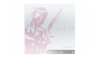
FFXIII PS3 slim


This is a Japanese limited edition PS3 slim, intended to be bundled with the game itself on release. I really love this design, the white console stylish enough with it's minimal shape and subtle curves, but what really makes it beautiful is the embossed design of the game's heroine, Lightning, picked out in a gorgeously subtle pink. The artwork is stark and appealing, and cleverly echoes the style of the lead concept artist's work, often seen in the background of the logos for each installment in the series. It really feels Final Fantasy, and every western fan of Square's flagship title should be shouting at the top of their voices for this machine to cross the seas, in order for us all to spend ridiculous amounts of money on it.

Ico

This is the cover art for the Japanese and European releases of PlayStation 2 game, 'Ico'. It evokes the major themes of the game (escape, protection of and reliance on your companion, aloneness and sparseness, verticality) and presents them in an artful, inspiring manner.
Below is the American cover:
Yuck. Just... Ugh.
This crime seems to have committed in order to appeal more to the American audience, and if I was American I'd be extremely offended by this idea. This design eschews all the subtlety and beauty of the original cover in order to present a generic, hero-centric movie poster design communicating nothing about the game and so familiar to contemporary America as to be void of all meaning at this point.
Similar issues have occurred with Final Fantasy releases, and one wonders if perhaps Japan views the U.S as incapable of appreciating classy, more minimal images, or decoding abstract allusions to actual thematic content.

Clarence Dock

Clarence Dock is in my opinion, Leeds' most beautiful area, modern architecture, wide open spaces and large expanses of calm water. Greenery would make it perfect, but I'll take what I can get in this city.
It's beauty is redoubled come the night, when bright lights reflect in the mirrored waters, and soft luminescence suffuses the buildings.
The focal point of the dock, when viewed from the riverside, is the Clarence Dock building, a curling matte white structure with the shape and texture of a beautiful seashell. The building is a tangible evocation of the airiness and freshness the area exudes, from the wide open pool to the wide open sky.
The architecture is incredibly varied, but in harmony, no building overpowering another, yet each pretty in it's own right, and emphasising the strong horizontal planes leading toward the main building.

Hellboy (comics)


Mike Mignola has created many things, but none so accomplished or respected as his Hellboy series. Both writing and drawing the entire main series himself (up until 'darkness calls'), Mignola crafted a unique world through his mastery of the visual narrative medium.
What I love so much about his pages is the atmosphere stirred up through his timing. Dialogue is spaced through the panels in a sparse, reflective manner, simplifying the reading of the page while enriching the world it illustrates. With no huge speech balloons obscuring the art and directing the hierarchy unnaturally, the eye is free to soak in the rich artwork and vivid colours. Other comic artists will have silent panels to describe a pause for thought, or to let the environment or action take centre stage, but Mignola is unique in his employment of small square panels dotted throughout his stories at key points, containing small designs or portions of architecture, rarely of any importance to the plot, but instrumental in making the story that much more real and tangible.
Hellboy is an essential comic, but on it's own terms, bending rules and unashamed of it's origins in pulp ideas. It is a pure example of the art, unpretentious and yet fanciful and experimental.

Sunday, 20 September 2009

Rationale

This is my blog for my Graphic Design course at the University of Leeds. I aim to detail here different designs that I find interesting, and share them. I will make sure to try my best to convey what specifically about them appeals to me, and try and tackle things from the 'design point of view' whatever the genre I am reviewing. I also aim to review things objectively, to judge things unbiased by my non-design feelings on my subjects. My critical thoughts on my topics will be constructive, and I will attempt to write down what I would rectify in order to fix any problems, should there be something wrong with my subject. I intend for most of my reviews to be positive, so I can share the things I really really like with anyone reading my blogs.
My hope in showing these things I love to everyone is that they will go on to inspire other people, and they will share my love for things like Scott Pilgrim, Penny Arcade and Hellboy.
The brief I am having to meet is thus:
Critically review 5 books, 5 films, 5 artists, 5 buildings / places, 5 museums, 5 websites and 5 designs. My blog must be professional, and no sarcastic comments must appear. This means I'm going to have to reign in my tendency to be sarcastic or scathing in my critical writing for comedic effect, which shouldn't be too hard, but I'll have to make an effort to not let my writing become dry as a result.
The intended result of all this blogging is to expand my horizons and force me to research and consider my influences in preparation for both my dissertation and my independent project this year. The idea is that I gain a better understanding of the design I admire, and a greater insight into the background of the designers I want to emulate and follow in the footsteps of. It is also important that I engage with and get to grips with our culture in general, so I can draw influence, ideas and inspiration from the world around me.
Other people's work and acheivements have always inspired me, and I've always collected my heroes' works around myself, to learn from and to enjoy. I have always enjoyed sharing them with other people, often even when they don't want me to, and I am extremely opinionated about a great many creative things, for example, films, books and videogames, and any mutations of those things there may be. I have a lot to say on a great many of these subjects, and hopefully this will serve me well in my blogging.
The other outcomes include the possibility that I will come out of this as a more professional critic and designer, with much more informed opinions. The ability to adopt a professional approach would be a useful tool, especially when it comes to talking to clients in the future, and not getting too attached to what I want to do personally.
Hopefully, I will be inspired by the blogs of my peers, and will learn new things from their writing. I am very aware that although I am very familiar with a fair few areas of design, I have a lot to learn, in certain areas more than others for certain, but there are many works in all areas of design that I have not yet come across, and hopefully my coursemate's blogs will reveal to me whole new worlds of inspiring work.
In summary, this project should be beneficial to me in a whole variety of ways, and I look forward to being inspired by new things, and sharing my own influences with my peers.